
Microsoft's Power BI is a business intelligence (BI) and data visualization tool that empowers users to transform raw data into compelling visual stories. Compared to traditional spreadsheet software like Excel, Power BI takes data analysis to a whole new level. While Excel excels at tabular data manipulation and basic charting, Power BI offers a more robust and dynamic environment for creating interactive and highly customizable visualizations. It also seamlessly integrates with a wide range of data sources, from on-premises databases to cloud-based services, ensuring that your analysis draws from the most up-to-date information.
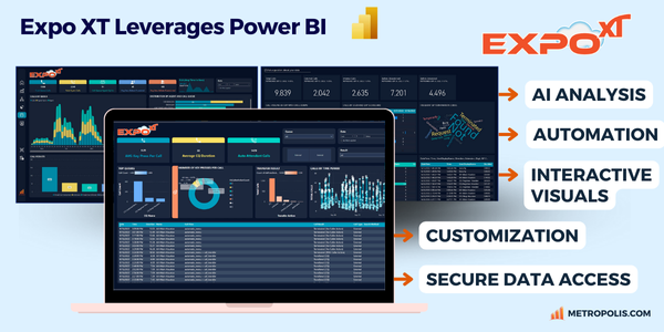
With it’s endless data visualization options, advanced analytical abilities, and powerful AI-embedded features, companies like Metropolis have built solutions such as Expo XT UC Analytics and ProfitWatch Power+ entirely on Power BI, providing deeper context into business communications.
Because of it’s powerful data visualizations and AI-embedded features, Metropolis has built Expo XT and ProfitWatch Power+ entirely on Power BI for deeper context into business communications.
Businesses of all sizes have found Power BI to be incredibly beneficial for expediting the transformation of their data into holistic views of their operations. The software’s versatility and gentle learning curve allows beginners to ease into data visualization, while more experienced analysts can enrich their data insights with AI-enabled tools, customizable charts, maps, and dashboards. Perhaps most crucially, Power BI's scalability ensures a future-proof solution that grows alongside evolving organizational needs.
Power BI offers:
Power BI shines in real-world data analysis scenarios by seamlessly integrating with multiple data sources and providing insightful visualizations. Consider a software engineering firm that aims to enhance operational efficiency and product quality. By connecting Power BI to tools like Jira and Zendesk, Power BI can aggregate and visualize data from development metrics and customer support interactions.
In this scenario, Power BI would track code commits, build success rates, and bug patterns, helping identify and resolve issues rapidly. Simultaneously, it can analyze customer feedback and support ticket trends, revealing opportunities to improve user experience and product features. This dual capability of monitoring internal processes and external customer feedback empowers the firm to make software improvements and eliminate bugs quickly to keep customers happy.
Power BI works by first connecting to various data sources, including databases, applications, or even streaming data. Once connected, you can extract and transform the data using Power Query, which is a built-in data preparation engine. This allows you to clean, reshape, and combine data from multiple sources into a single data model and then create interactive visuals (i.e. charts, graphs, dashboards, etc) using the Power BI Desktop application.
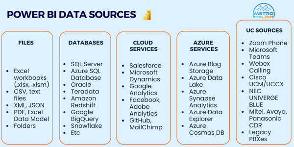
Expo XT has MetroLink, a Power BI Connecting Tool for PBXes built in, making the connection, storage, and labeling process between varied CDR, SMDR, GRAPH and other UC specific data sources simple.
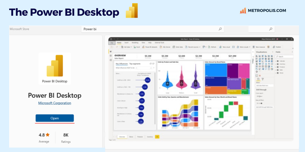
The Power BI Desktop Application is a free Windows-based tool that runs on your local machine and supports over 100 data source types. For installation, navigate to the Microsoft store, do a quick search, then select ‘download Power BI’.
Power BI can be connected with various data sources like files, databases, Azure services and much more.
Data transformation in Power BI helps ensure your data is clean, consistent, and structured appropriately for your analysis needs. This is done by using the Power Query tool, an ETL (Extract, Transform, Load) that is integrated into Power BI and acts as a bridge between your raw data and meaningful insights. The data transformation step allows you to clean, manipulate, and standardize your data easily before you move into the data modeling step to ensure you get the best results for your analysis.
Common transformations include:
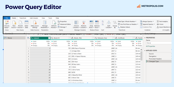
When using multiple data sources or looking to join two related data tables, you’ll want to merge them into one. All the tables to be merged need to have at least one joining data point to connect them (i.e. a customer number or email that appears in both tables).
If you have data tables that have similar data split across different tables (for example, multiple months of performance data with each month located in separate files), you can load this into the Power Query and blend the tables together through the Append option.
Merging Queries:
Appending Queries:
For more advanced data shape transformations, to combine queries, and to edit M code, you can use the Advanced Editor.
Once your data has been shaped, transformed, and combined as needed, it can be loaded into Power BI Desktop. This is where the real magic begins, as you can now leverage your clean, structured data for powerful analysis and visualization.
To create visualizations in Power BI, you’ll work primarily from the Report View. Power BI offers four main views for designing and managing your data:
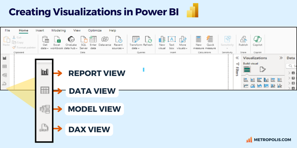
From the Report View, you can create various visualizations, including charts, tables, matrices, and maps. Power BI allows extensive customization, such as changing measures and dimensions, adding legends, and comparing multiple measures. Once you've set your desired parameters, you can pin these reports to interactive dashboards, providing at-a-glance insights across multiple data sources.
Filters are essential in Power BI for refining data to focus on specific subsets. They help you drill down into data by allowing you to include or exclude particular data points based on certain criteria. Filters can be applied at different levels:
Using filters, you can interactively explore data, highlight trends, and make more informed decisions by viewing the most relevant data points. This enhances the ability to analyze data from different perspectives and uncover insights that might not be immediately apparent from a broad dataset.
DAX allows users to create measures, calculated columns, and tables that go beyond basic aggregations. For instance, while a simple sum or average can be done with built-in features, DAX enables calculations like year-over-year growth, running totals, or custom metrics that dynamically adjust based on user interactions within a Power BI report.
The syntax of DAX is similar to Excel formulas, but it's tailored for more complex and relational data operations. DAX includes a rich set of functions, such as aggregation functions, logical functions, and time intelligence functions, which allow users to perform detailed analysis over time series data and across different relational tables.
Power BI has a wide range of choices for sharing, collaborating on, and integrating reports and dashboards.
As you finish your reports and share them with colleagues, you'll find that Power BI becomes an indispensable tool in your data analysis toolkit. The more you use it, the more proficient you'll become at uncovering insights and telling compelling data stories.
Power BI is constantly evolving, with new features and improvements released regularly. Stay curious, explore the Power BI community for inspiration, and don't hesitate to experiment with advanced features as your skills grow. With practice and persistence, you'll soon be transforming raw data into actionable insights that drive informed decision-making across your organization.